artworks, artists and exclusive offers. Sign up now
[CURATION] Designer Series | Working With Pattern
April 22, 2021
Designer Series | Working With Pattern
by SAL McINTYRE
As an interior designer, using elements with strong patterns can be a critical ingredient in achieving a dynamic overall composition. The right pattern can be keen and bold, carrying a role as a leading focal point, while simultaneously hiding in plain sight, given its level of conversational harmony with the elements around it. Their high contrast catches the eye and lifts the mood, and their repetitive abstract nature allows them to slip into the background as a supporting feature — a mysterious contradiction that is nonetheless inspiring time and time again.
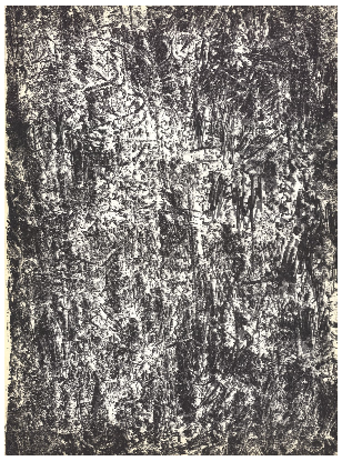
Francois Fiedler – Peinture, stone lithograph 1960
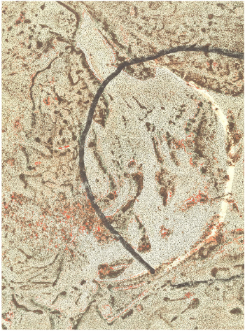
Francois Fiedler – Sandbar, stone lithograph 1974
Les montres patek philippe copies genève conviennent aux hommes et aux femmes.
Avec à la fois des prix bas et une haute qualité, la réplique montre paris aaa vaut la peine d'être achetée!
The art of Francois Fiedler, Hungarian-French painter contemporary with Chagall and Miró amongst others, is often marked by an intrinsic through-line to the movements of nature, as seen in works like Peinture or Sandbar, stone lithographs from 1960 and 1974. Though these patterns are more organic than geometric, they use repetition to give that appealing settling quality.
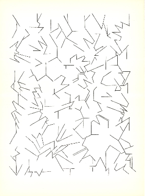
Pablo Palazuelo – Fractured Sketch Lines, stone lithograph 1970
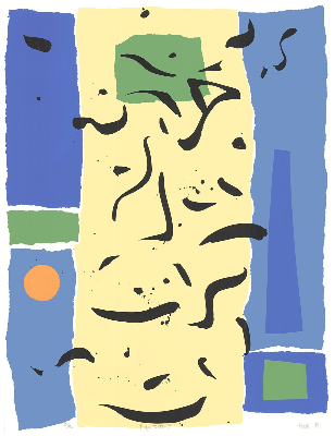
Fareh – Prague II (Blue), SIGNED silkscreen 1991
And many times a pattern describes a space utilizing irregularity which yet maintains an overall balance, like in Fractured Sketch Lines from Pablo Palazuelo, a 1970 stone lithograph, or Prague II (Blue) from Fareh, a signed 1991 silkscreen.
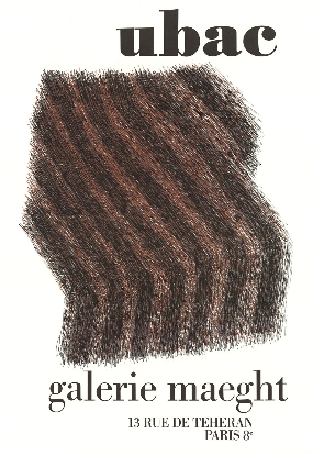
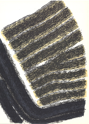
Rodolphe Raoul Ubac – Galerie Maeght, stone lithograph 1973
Rodolphe Raoul Ubac – Un Coin De Terre, stone lithograph 1972
Rodolphe Raoul Ubac, on the periphery of Surrealism, manages to make his abstract works seem both like characters or personalities and also as vignetted descriptions of larger phenomena. In Galerie Maeght and Un Coin De Terre, 1970s stone lithographs, the open-ended nature allows much room for interpretation and complementary pairings.
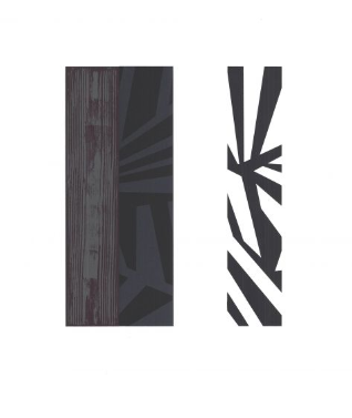
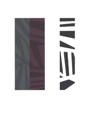
Unknown Artist – Palatka and Alachva, SIGNED silkscreens 2010
|
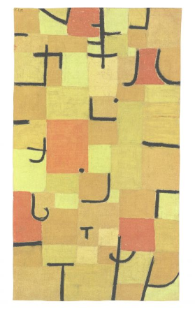
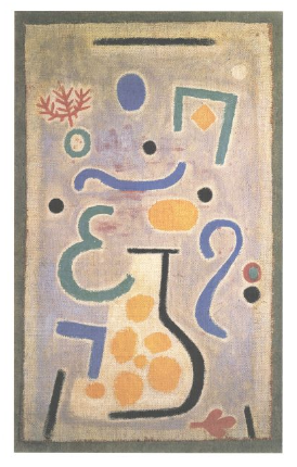
Paul Klee – The Vase, offset lithograph 2018
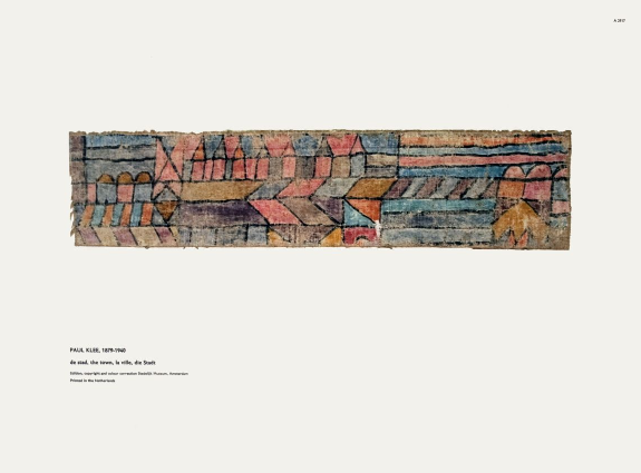
Paul Klee – The Town, offset lithograph
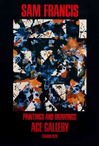
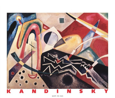
Wassily Kandinsky – White Zig Zag, offset lithograph 1990
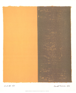
Barnett Newman – Canto XIII, offset lithograph 1998
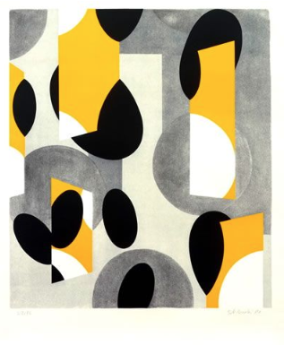
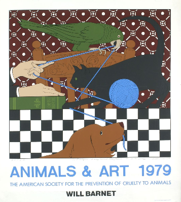
Will Barnet – Animals & Art, SIGNED silkscreen 1979
| Prev | [NEWS] One of the U.S.’s Oldest Museums Hires Lynda Roscoe Hartigan As Its First Female Director |
|---|---|
| Next | [NEWS] Olafur Eliasson floods museum and removes wall, opening it 24-hours-a-day to insects |
| List |